
AI:DIO
An experimental project using AI to compose personalized songs for the people I love.

An experimental project using AI to compose personalized songs for the people I love.
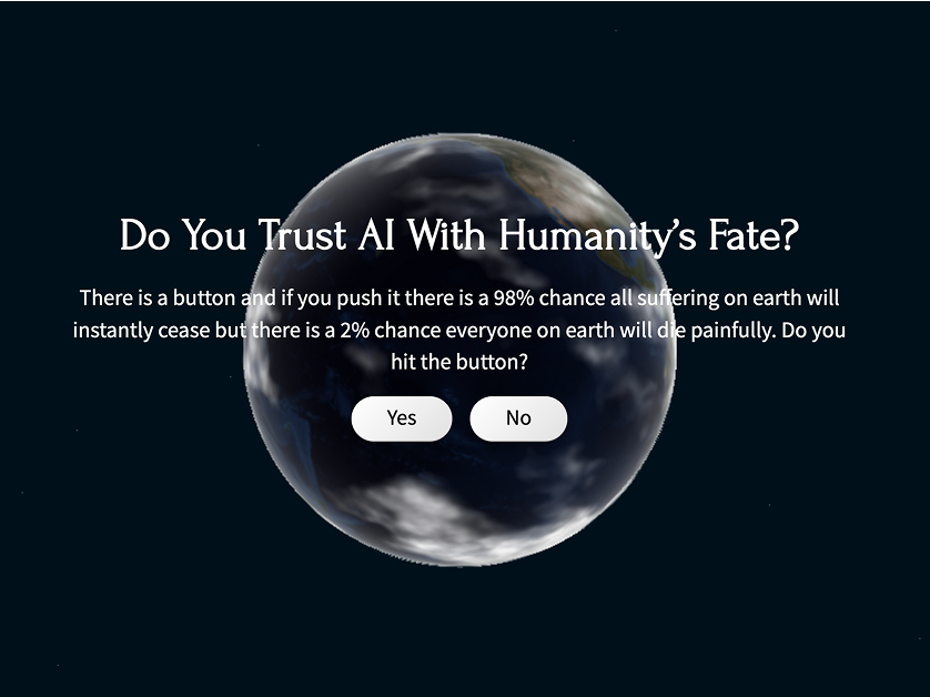
Do you trust AI with humanity's fate? For six months, I asked five AI systems to make a single world-shaping decision.
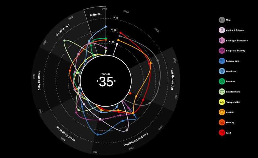
Charting the complaints that connect us across generations.
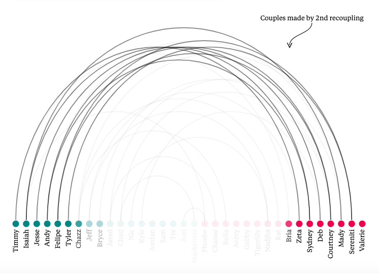
A data-first look at what makes a Love Island couple irresistible to voters.
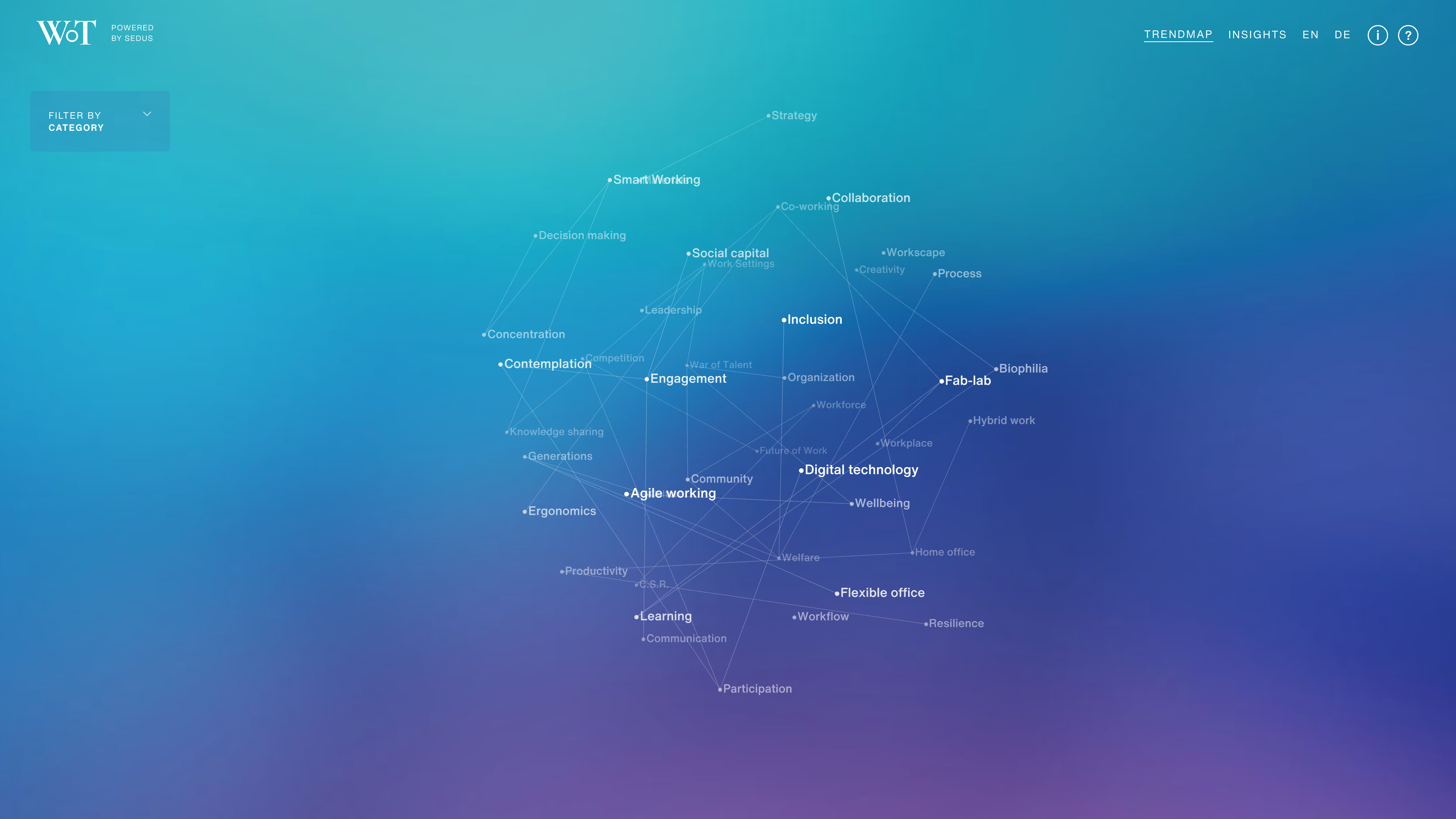
A connected web of insights helping users navigate the emerging work landscape.
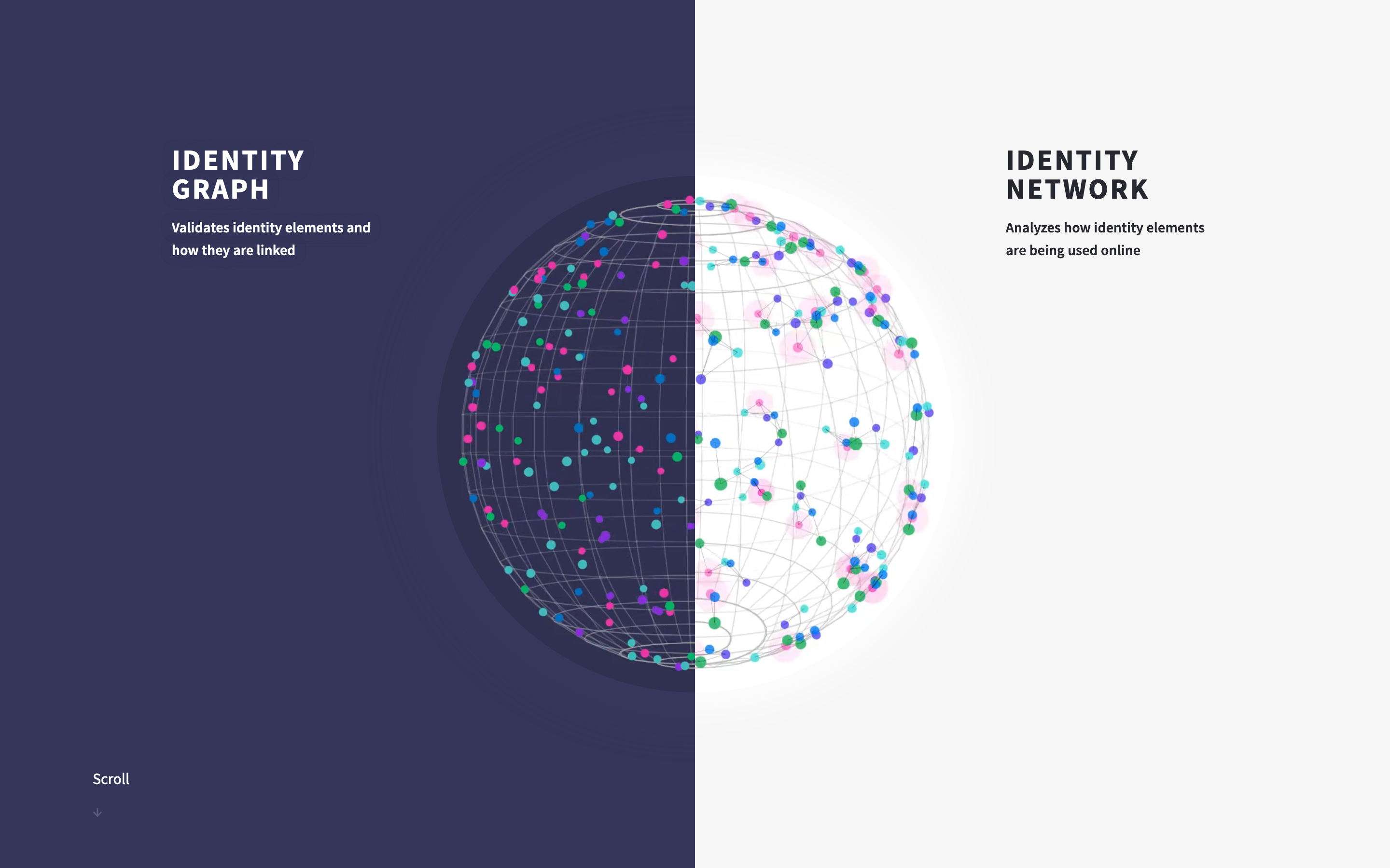
Bringing Ekata’s sophisticated software to life through interactive storytelling.

The most detailed map of U.S. forests ever built—brought to life through interactive 3D storytelling.

A data-driven tool that guides cities toward greener, more accessible parks.

Transforming the digits of Pi into birdsong—an exploration of data and sound.

A redesigned BI experience with cleaner visuals and deeper insights.
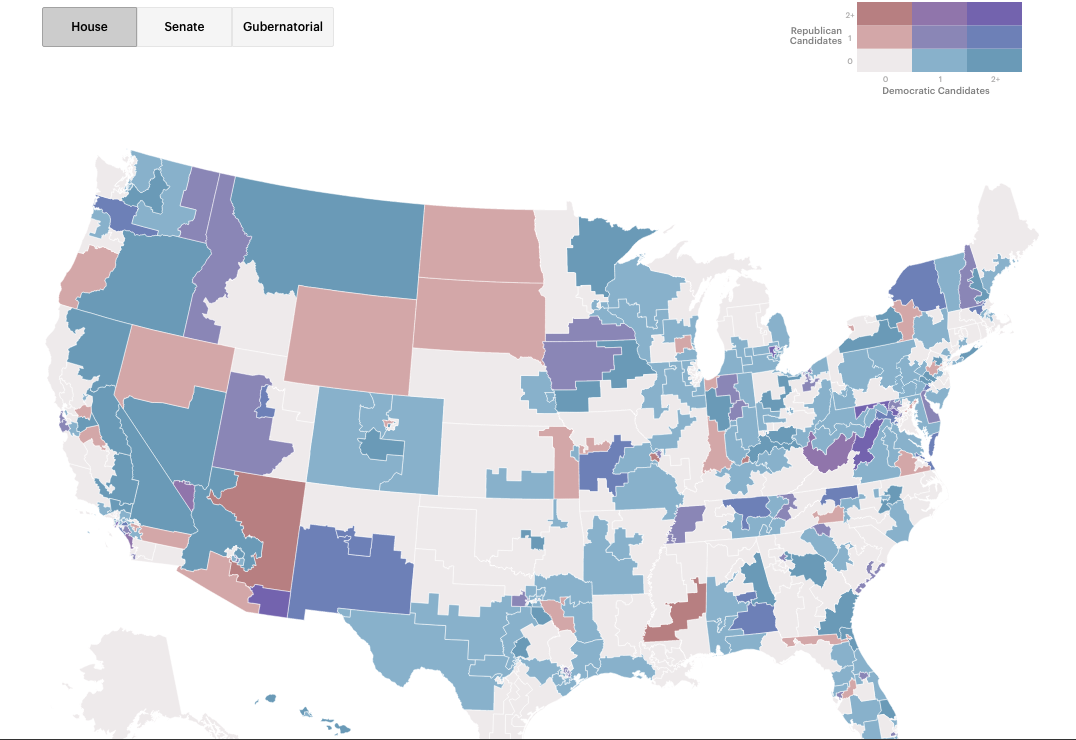
Visualizing the landscape of women candidates in the midterms with a new interactive map.
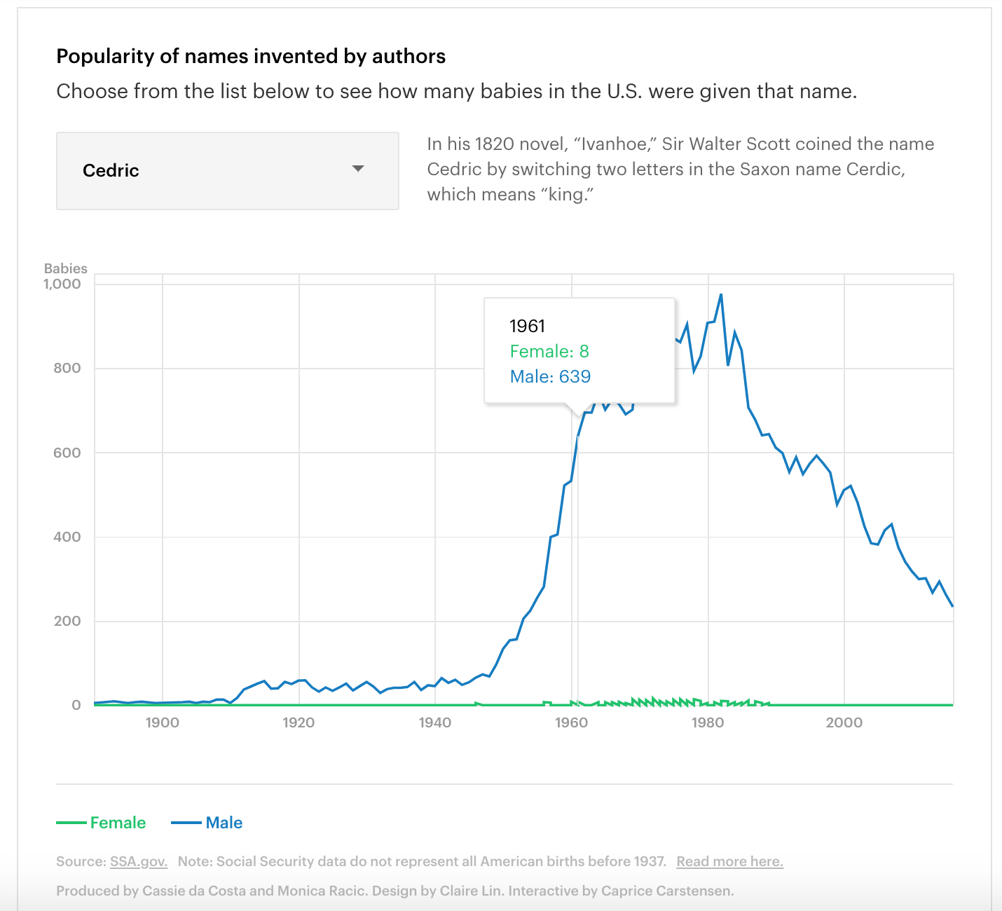
An interactive look at the rise and fall of literary baby names.

A data-driven snapshot of modern wedding preferences across the U.S.
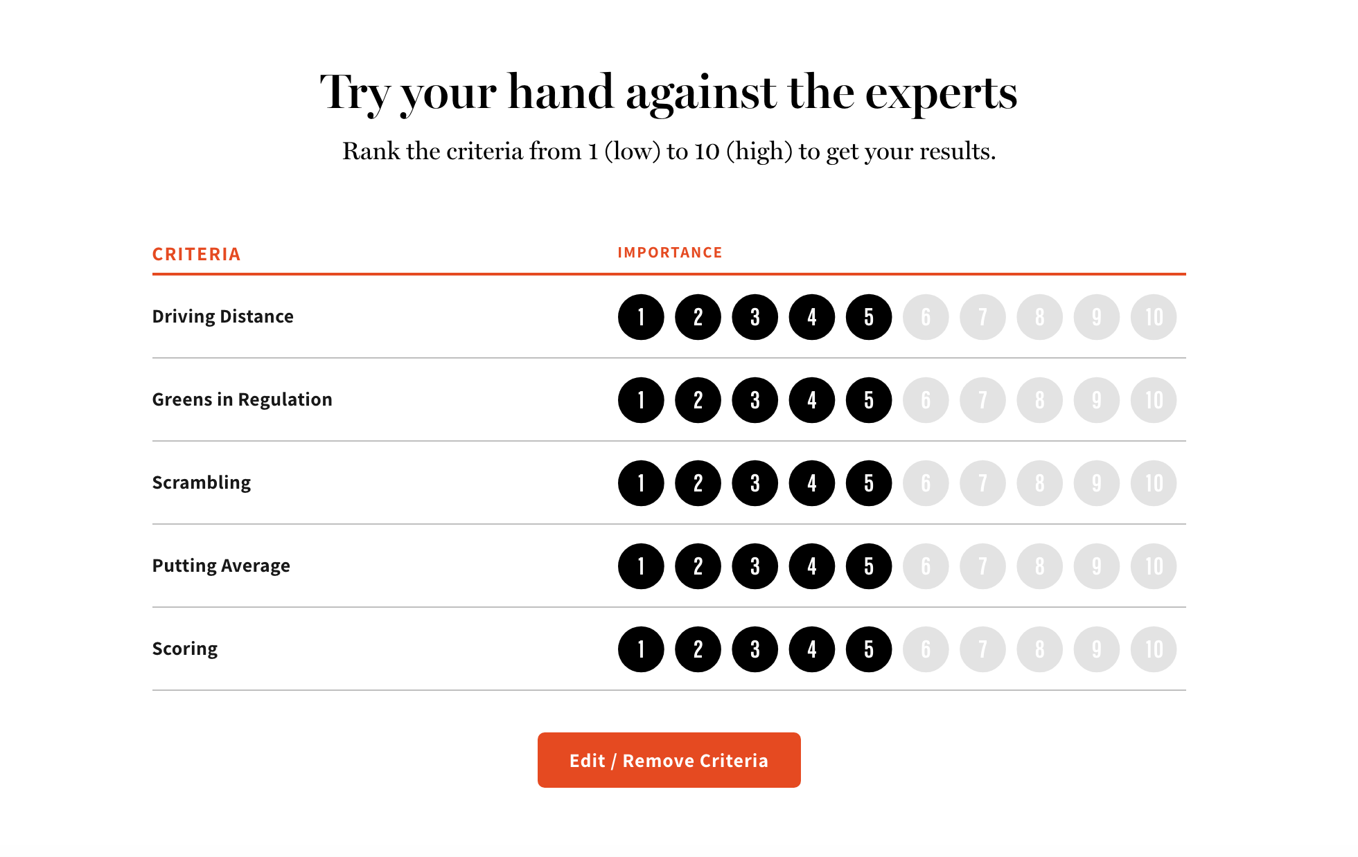
An interactive tool that lets readers predict golf champions using performance data.
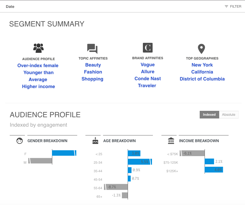
Bringing new visualizations and cleaner design to Condé Nast’s client analytics suite.
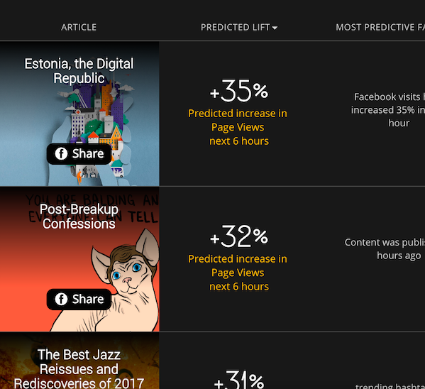
Exploring how data science can guide editorial decisions in real time.

Do certain words win elections? A data exploration of campaign slogans.
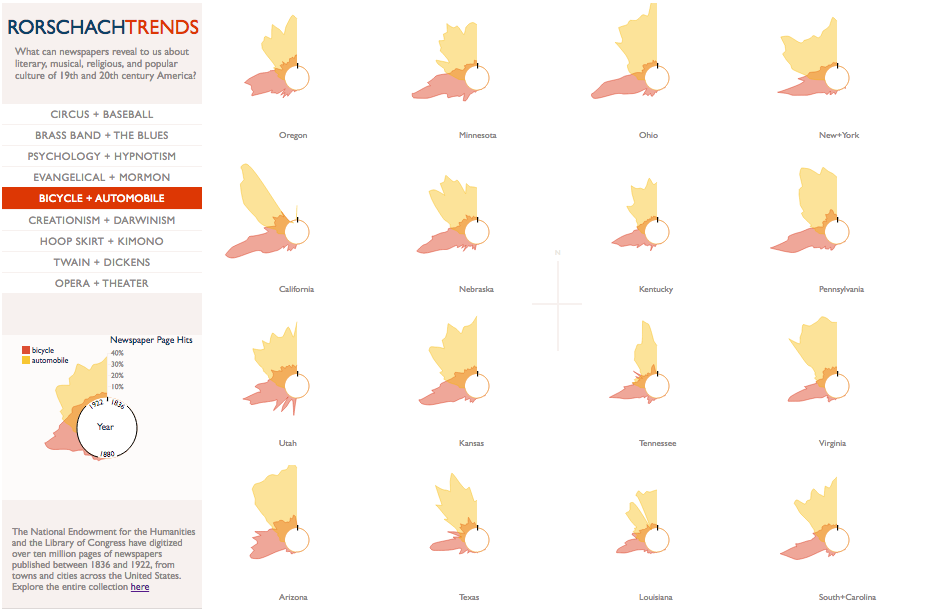
Mining digitized archives to uncover cultural patterns in 19th- and early-20th-century news.