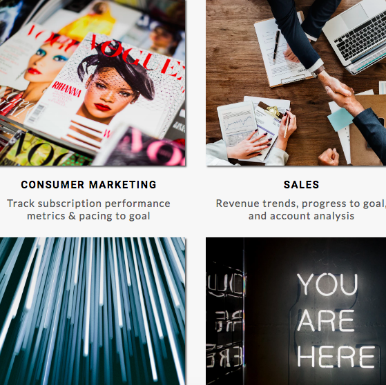
Conde Nast’s internal BI brand, Dash, received a facelift one year after its initial release. As a team lead, I led the push to update
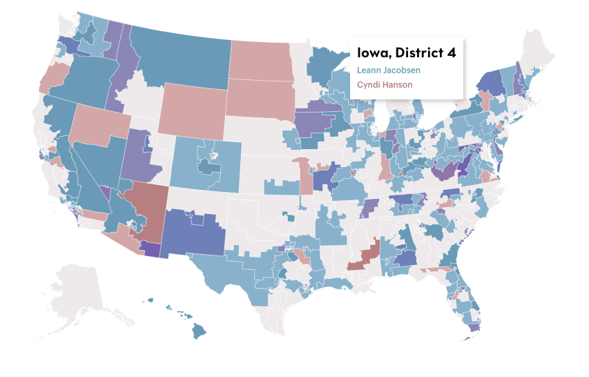
I was able to introduce The New Yorker readers to their first interactive bivariate choropleth map. Collaborating with the interactives team, we shared a desire
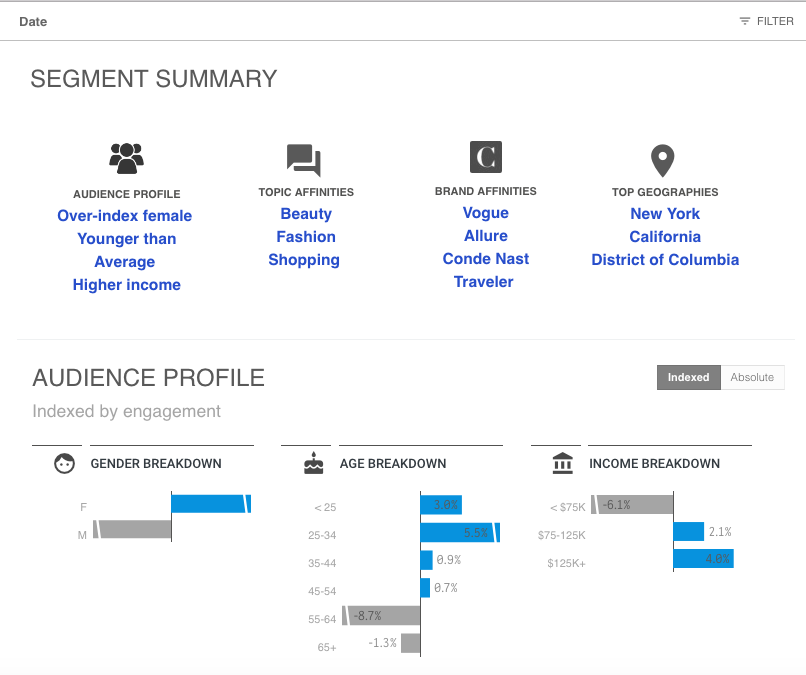
Leading my team at Conde Nast, we gave our external client dashboards a facelift with updated overall design, some new data visualizations and more insights!
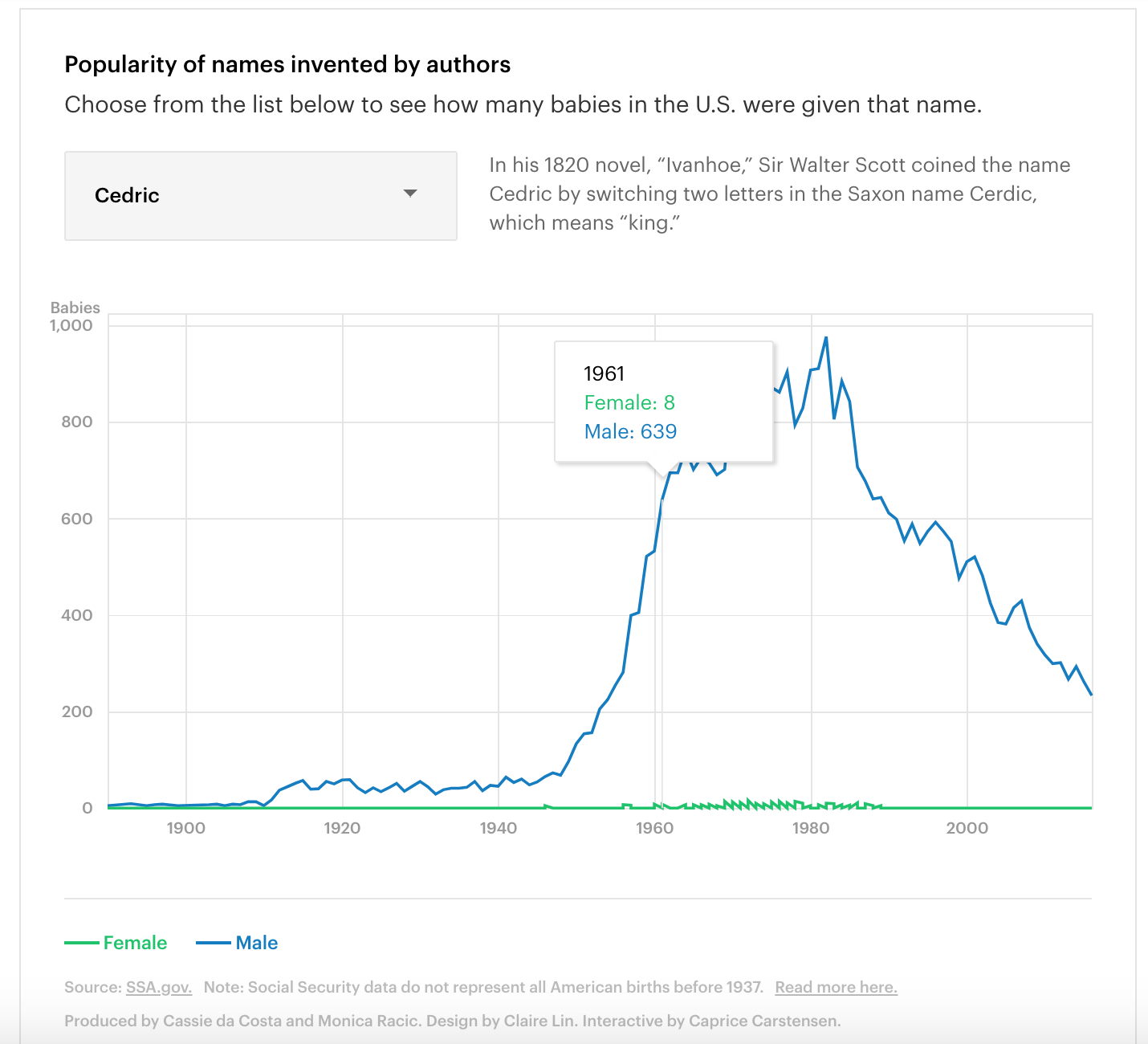
Collaborating with the New Yorker team, I developed an interactive line chart showing the popularity of literary baby names. You can find the article here.
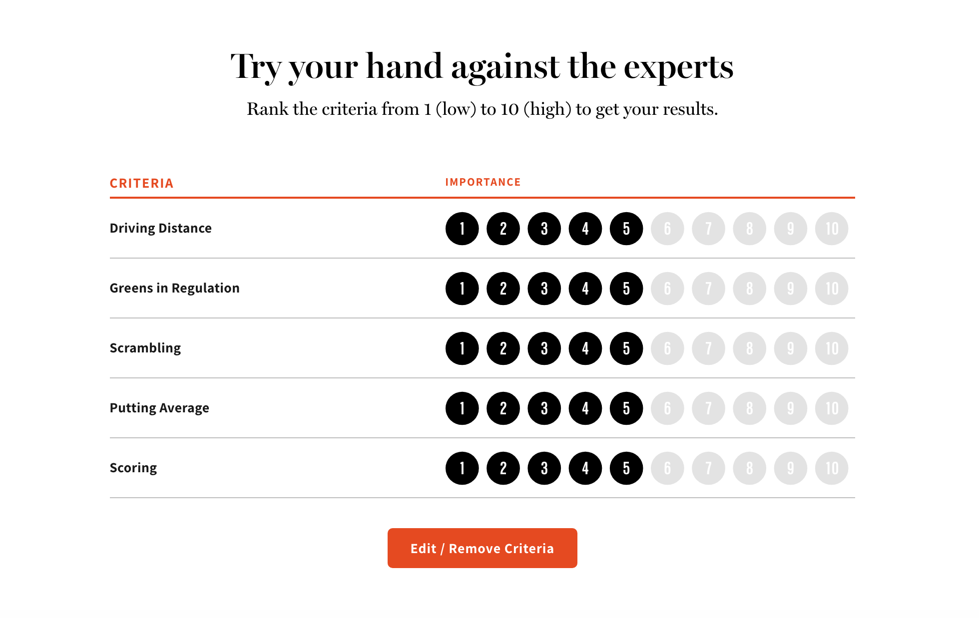
In collaboration with Golf Digest Editors and Condé Nast’s Design team, I created an interactive tool that allowed readers the ability to predict the winner
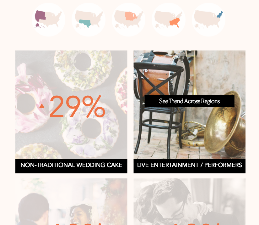
I worked with Brides and their annual survey data to uncover the trends of 2018. You can find the interactive piece here.
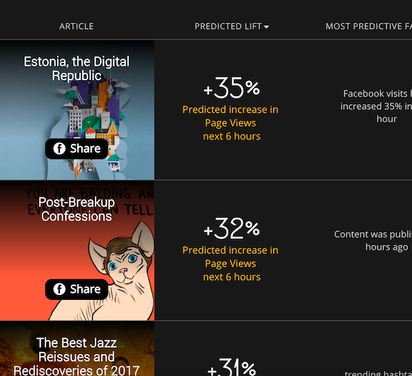
Collaborating with the Data Science team, I prototyped an interface for article suggestions based on trending topics on social media.
